
FUTURA TYPEface Booklet
Print Design - Writing & Research
The assignment at hand was to create a typeface booklet with research specifications and
content to pair with it. The typeface I drew at random was Futura, backed by a near century of usage and rich history.
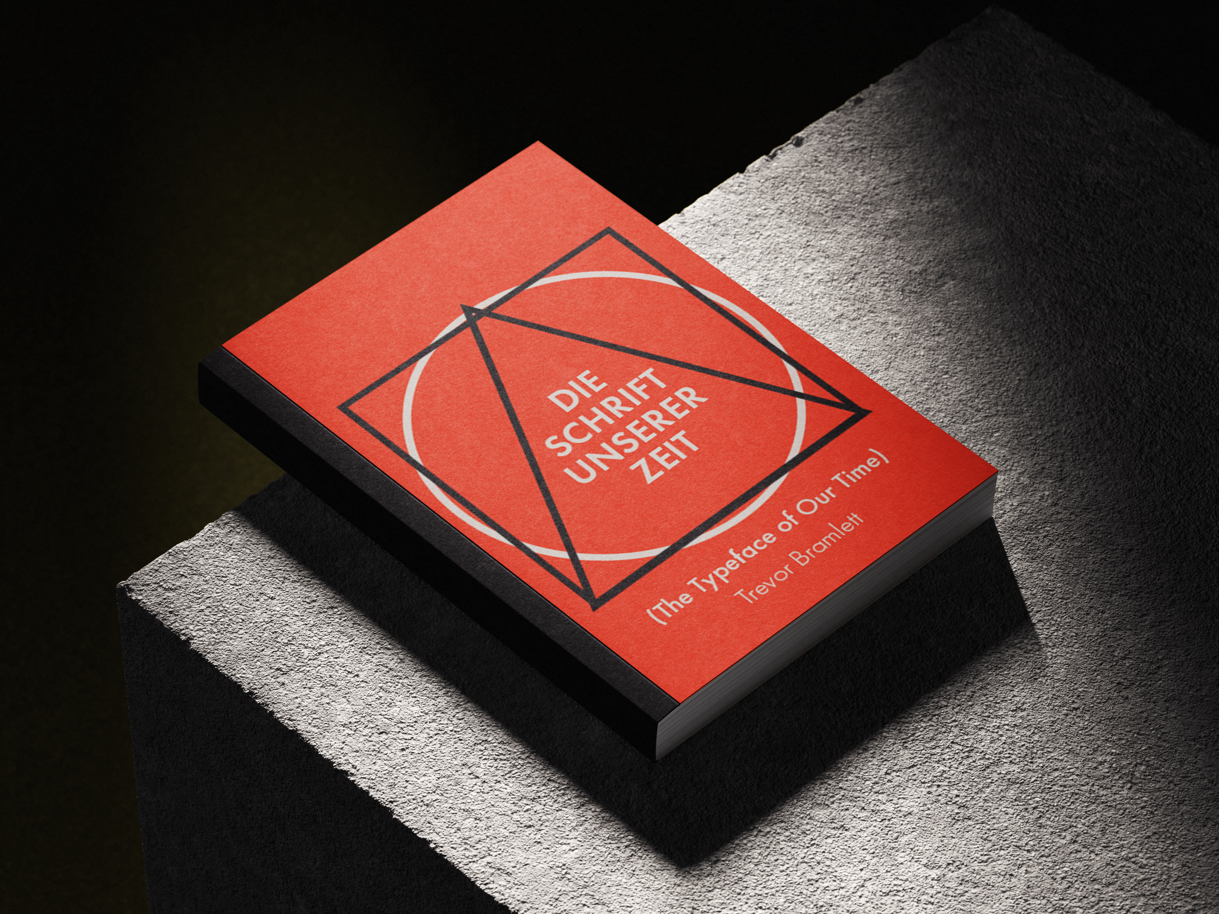
I knew I wanted to center my booklet around the
history behind the typeface, and tell its story of how it became the giant it is in the design world. Its rise from rebellious conception to cultural recognition.

Research
Reference Texts

Paul Renner: The Art of Typography
By: Christopher Burke

Futura: The Typeface
By: Petra Eisele & Annette Ludwig
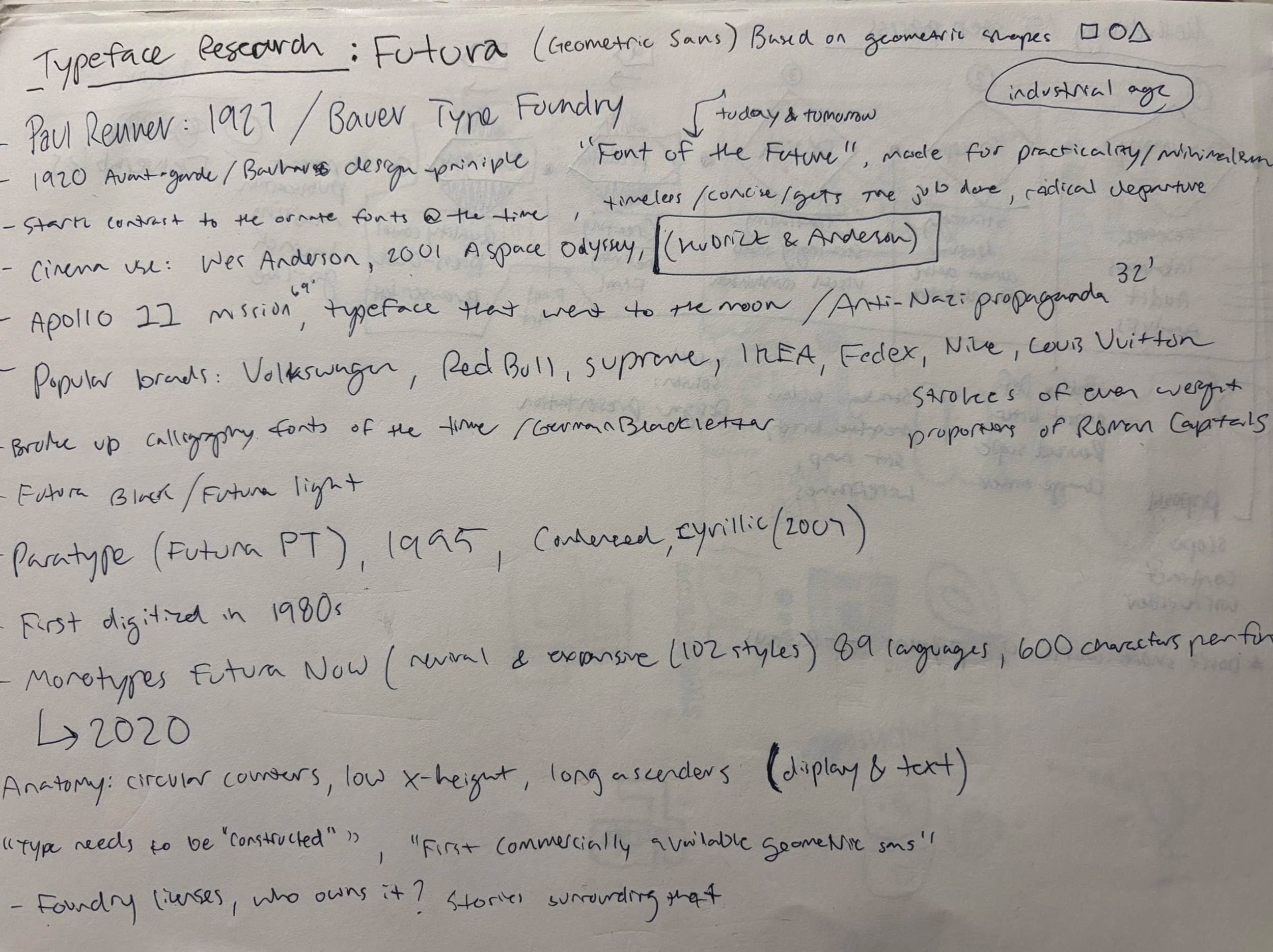
To start my research I began online looking up the timeline of the typeface’s creation and spread around the world. I wanted to find out how it became as popular as it did, and how it became the logotype for so many major companies. Apart from my online desk research, I checked out two books : Futura The Typeface & Paul Renner The Art of Typography.
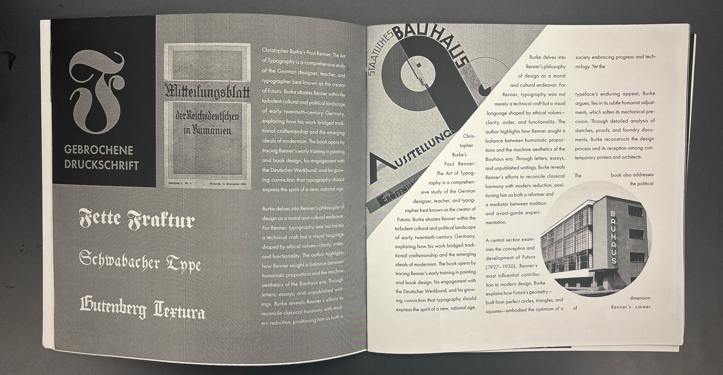
Prototype Booklet (Used to check type size & spacing)
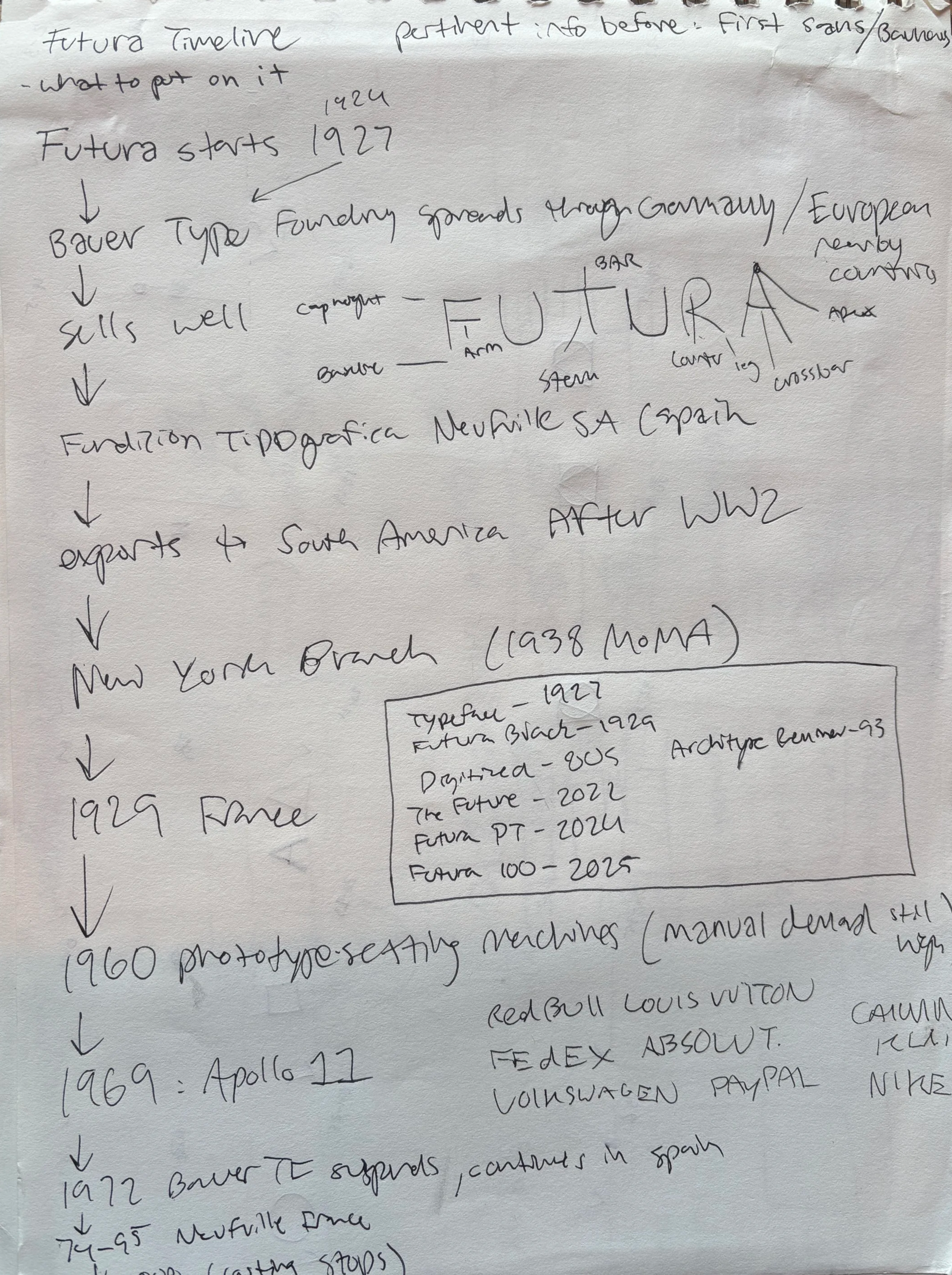
My first prototype had initial layout concepts in black & white. Inspired by the use of squares, triangles, & circles in the typeface’s construction I created layouts with the shapes in mind. The flow of layouts was finalized at this stage, running from the creation of the sans-serifs, to futura’s alphabet, its creator, the cultural spread timeline, and typeface pairings/styles before the concluding spread.
I didn’t only focus on the how it earned its status, but spent time reviewing the type’s construction, what makes it unique, and its inspiration. I decided to highlight Futura’s creation as a rebellious entity, daring to defy rule in Germany during WW2. I outlined its journey through various countries, high fashion, and cultural impact as it became one of the most recognizable typefaces.
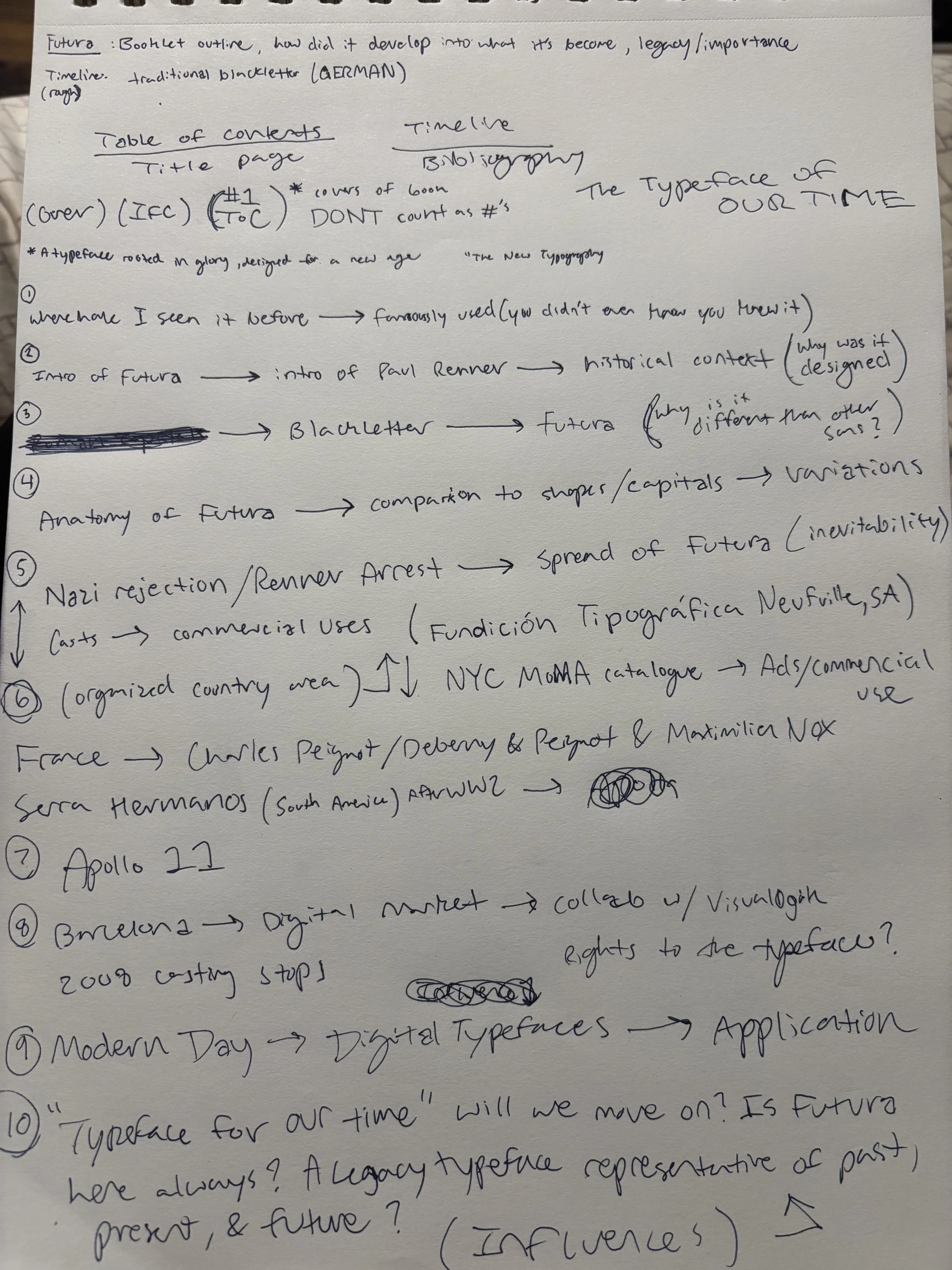
Execution

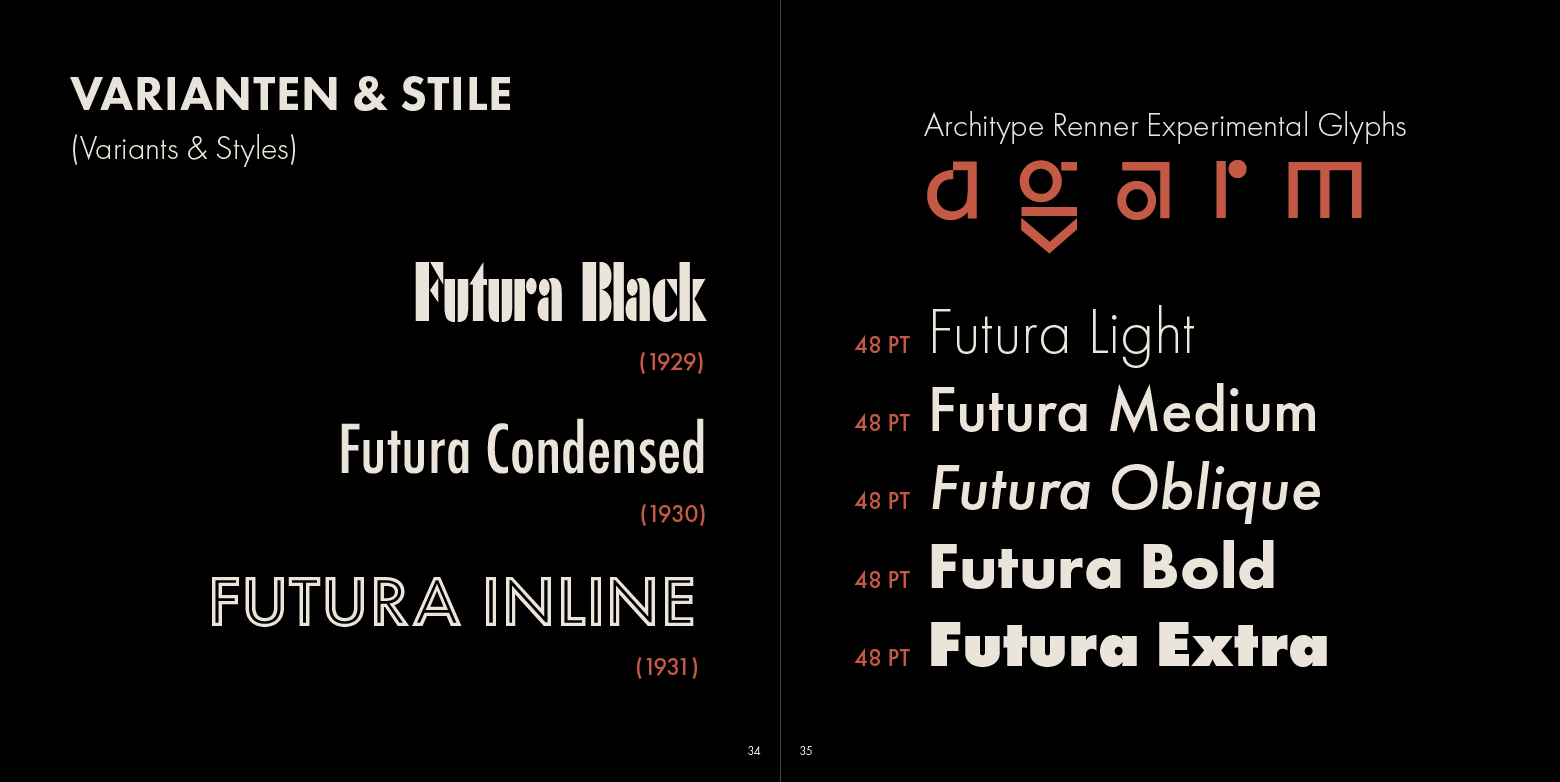
Pictured below are spreads from my final booklet. I established the shape inspiration in the table of contents page and applied it throughout. I kept my headlines consistent in the booklet and employed a color scheme inspired by original usages of Futura in photomontages.
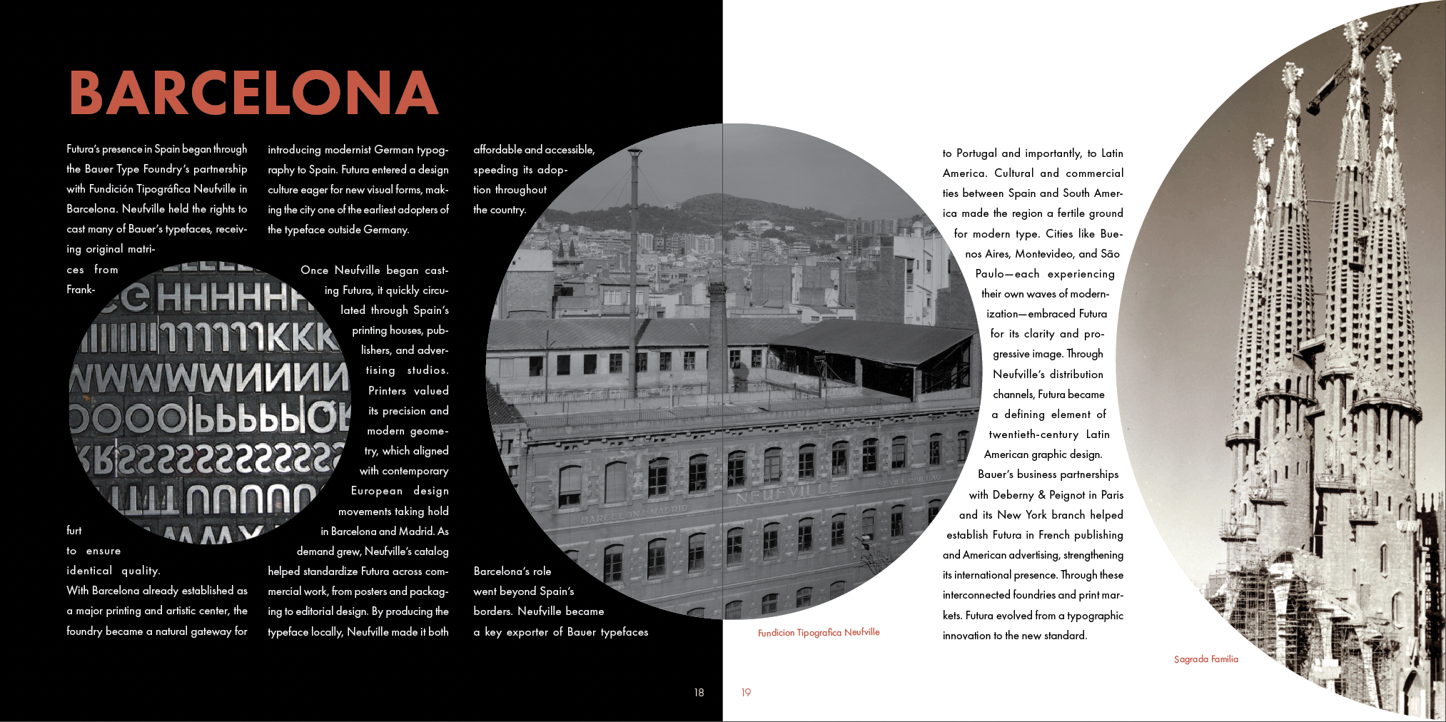
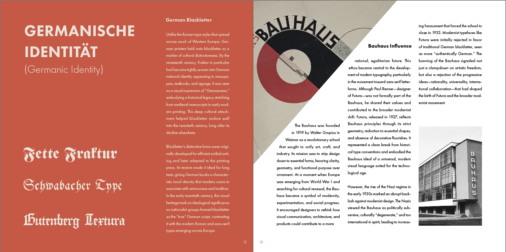
The color palette acts as a modernization of the German tricolor, underscoring the central irony of Futura's history: a typeface designed to embody industrial progress, banned by a regime too entrenched in mythologized Germanic tradition to accept it.
FInal REsult
My final booklet achieved what I set out to accomplish: create a typeface booklet that showcases the feel and function of the type, while telling the story of Futura’s rise in culture. I captured what makes Futura different from other sans serifs, and its compelling origin story.
As a fun nod to its Germanic roots, I utilized German for the header titles throughout with translated English. This project sharpened my design skills through keeping aesthetics consistent, exercising layout/print design, and personal desk research that fueled my work.